 I recently discovered inuitcss and I’ve fallen in love! Why? It’s simple.
No, that’s the answer. It’s simple, as in, inuitcss is simple. So what is it, and what was wrong with Bootstrap?
inuitcss is sassy
What is sass? It’s this CSS templating language. It isn’t overly complex. But the idea is that you can express combinations of CSS patterns using loops, imports, etc., without the final effect being costly. SASS essentially compiles your CSS templates into a single main.css file that you pull into your web page. inuitcss uses sass most effectively.
For starters, inuitcss is broken up in LOTS of tiny modules. That way, you only pull in the modules you are interested in. For example, if you want to create tiny images with text next to them (Facebook status updates anyone?), you grab inuit’s object.media module. It is really small, and hence easy to grok what it does. You want layouts, i.e. dynamic, flexible grids? Grab the object.layout module. Each module is simple and nicely separated from all the other modules. Just pull in what you need. In the end, it makes it easy to slowly but surely, learn what its doing.
I could never figure out Bootstrap did because it was SO BIG and monolithic in size. I just imported everything, buckled my seatbelt, and held on tight.
inuitcss can be as small as you want
Each module has an enable flag. Some, to turn on the whole module. Some modules have multiple sizes. For example, object.buttons has small, large, full, and pill. You enable what you want, and only those parts end up in your final CSS file.
inuitcss has sizing options, and you can pick whether you want CSS classes like desk-1/2 or desk-one-half (or both!).
inuitcss doesn’t impose any design upon you
This is the part that really sells things. When using Bootstrap, I had to learn this structure my HTML had to assume. I always hated showing the web layer at presentations, because all that HTML takes up so much screen space. People don’t want me to talk about complex layouts from Bootstrap. So I would always wave it away, pointing out its Bootstrap, and jump to the rendered site. Yech!
inuitcss is simply a bunch of CSS classes. A few have some rules, such as the structure a media object must undertake (like a media element containing a media-img and media-body subelement). But that’s it! Most of inuitcss is how to style components, not how to string them together in the big picture. And for a CSS newbie like me, that is perfect. It makes the task of building a nice looking site not appear ominous. I don’t have to undertake learning all the ins and outs of such complex things as Bootstrap.
By using inuitcss, I was able to style an already built app, and not change gobs of structure! I find that to be a breath of fresh air.
For a pre-alpha release, inuitcss looks really good, especially for responsive!
One of my tasks was to take my 90’s looking web page and style it for responsive. I really didn’t know what I was doing. But inuitcss made it approachable. I worked with one part of the interface at a time. As I got the hang of its simple classes, I was able to fine tune things. Eventually, I overrode the default colors to plug in my own. I tweaked the line heights (with one setting), and then plugged in a custom font (Ubuntu font family of course!).
Not only did I want styling, I wanted it to work responsively. I had read about the gory details of coding it. I had read a detailed article about em’s, media queries, and other stuff. I figured I was in for a world of hurt given my lack of CSS knowledge.
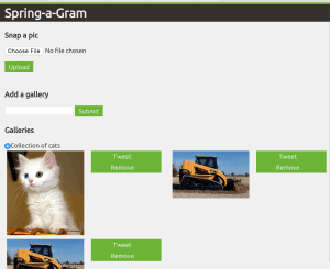
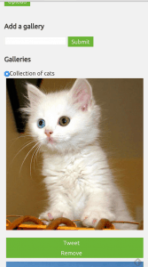
inuitcss made it super simple! They had built in media queries to apply to certain styles and pre-built breakpoints. Basically, you can saw laptop-and-up-1/2, and it parse that as any screen resolution of the tablet device or higher, render with half of the screen width. Or palm-1/3, translating into if-this-is-a-phone-render-with-1/3-of-the-screen. They had one other setting that said to stop floating to the side, and instead stack vertically. I applied that to the palm breakpoint, as you can see right here.
The previous version of inuitcss was a single toolkit. I decided to take the plunge and use the pre-alpha, multi-module, multi-github-repo version. It means that I don’t have access to many of the existing components, like greyboxes. But nonetheless, I have built a sweet demo app for my technology stack that doesn’t suck. And of which, I don’t have to wave my hands because it looks like another Bootstrap cookie cutter project.
I can tell you this: my site certainly looks different (apart from me ripping off the color palette of spring.io).
I’m not going back
In the past, I have commented how Bootstrap makes me look good. While true, inuitcss makes me look wicked! And it seems easier.


0 Comments