I just spent two days adding a mobile front end to a web app a few months ago. It is a reference app called Rabbit Trader, an app that demonstrates our JMS on Rabbit module targeted for vFabric 5.3. To hear more about that module, you’ll have to wait a bit.
All I can say is that it has been a blast! Of course with any good progress there are always lessons learned. Here are the ones I want to discuss in this blog entry:
- Don’t try to have any one page or template serve up both mobile and non-mobile UI.
- A framework with continuous editing is a must.
- Add things one piece at a time.
- Test it on a mobile device.
- Think about your favorite mobile site as a source of inspiration
I was working with the Play Framework 2.0 Scala, and had built a rich web app based off their chat app. It’s purpose is to push simulated stock trades out over a message broker, and then let the consumer threads display them in the chat channel. At the same time, users that are logged in can also chat amongst themselves.
I had the rich desktop interface put together pretty quickly, because it was already developed in the websocket-chat example. I decided to take a crack at using jQuery Mobile to add a mobile view. I had already seen one presentation last March at the DevNexus conference and also read a book as well. It looks pretty easy, so why not give it a shot?
Let’s walk through the things I learned while working on this.
Don’t try to have any one page or template serve up both mobile and non-mobile UI
At first, I tried to adjust the existing pages so I could pass in an argument like (mobile: Boolean), and simply have an if-then chunk of code in my templates. That seemed like it would reduce the chance of repeating myself with certain idioms to talk to the back end.
That turned out to be a real hassle. By adding extra arguments to the templates, it seemed to break the API that was setup, and really showed me that I didn’t fully understand Play’s template engine. Perhaps if I understand it inside and out, I could have solved that problem. But since it proved too much to handle, and was causing the normal web pages to not work either, I ended up throwing everything away at the end of the first day and starting from scratch on the second day.
Chalking it up to a learning experience, I started the second day with a clean slate, and instead built the front end without touching the existing pages. By using a
single-page template for the login page and a
multi-page template for the rest of the UI, I got things moving very quickly.
A framework with continuous editing is a must
Play offers the ability to run your app and then make code edits constantly. All you have to do is reload the page and the server recompiles and restarts things. Only on rare occasion did I have to shut things down. This made it much easier to experiment here and there.
Most of the current web frameworks offer this, like Grails, Play, Rails, Roo, Django, and CherryPy. The SpringSource Tool Suite comes with tc Server installed. You can deploy a Spring MVC app there, run tc Server, and as you make edits, they get synchronized. The lesson here is use it! The feedback is critical to building a usable app.
Add things one piece at a time
There is more than one occasion where I started coding too many things before testing the interface. The places where this would get me the most was when I would tweak the javascript. My app uses websockets to provide a publish-subscribe flow of data from the server to the client. The UI has to connect to a socket, and as events are pushed to the client, generate dynamic HTML to append to a div container.
Basically, all this was already written with Play’s websocket-chat example. But it was coded using Twitter’s bootstrap look-and-feel. I started with their layout of div containers, and tried to edit them, but it turned out simpler to simply start with a clean slate and build the mobile perspective from nothing one component at a time.
This also forced me to switch my mode of thinking from retooling the UI to building it clean. This also let me focus on using jQuery Mobile’s style of application. The more I focused on using jQuery Mobile’s style, the better my app looked.
And by adding one change at a time, I was more efficient at learning one idiom at a time, both jQuery Mobile as well as javascript/jQuery.
Test it on a mobile device
I did most testing on my laptop and just pointed my browser at localhost:9000/mobile. But nothing can take the place of looking at it on an iPhone. That tiny screen really shows you how precious real estate is.
In the rich frontend, it has a sidebar widget showing all the users that are connected to the channel. I had reconfigured it to show them at the bottom. When I looked at it on my phone, there was simply no room for that. I also decided that I didn’t really need that information, so I dropped it.
jQuery Mobile makes it a snap to put buttons anywhere and everywhere. It’s very easy to put a
left and right button on the header. You can also add standard icons which make it look even better. I put a “
Disconnect” button on the left and a “
Compose” button on the right of the header, but when I viewed it on my phone, they took up way too much space, overwriting the header itself. So, I opted to drop the text and only show the icons.
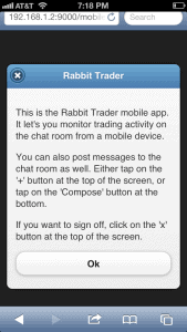
This drove me to add a third button for information. I tried to put it at the top, but it turns out that headers only have room for two buttons, and I had used them up. I wasn’t about to add a
navbar just for the sake of an info button. So I created a
footer navbar with the info button. It displayed nicely, but the footer itself was as slim as the button. I added
class=”ui-bar” and it added just a touch of padding, making it look perfect. Finally, I topped it off with
data-position=”fixed” so it wouldn’t get pushed off the screen as new messages arrived from the websocket.
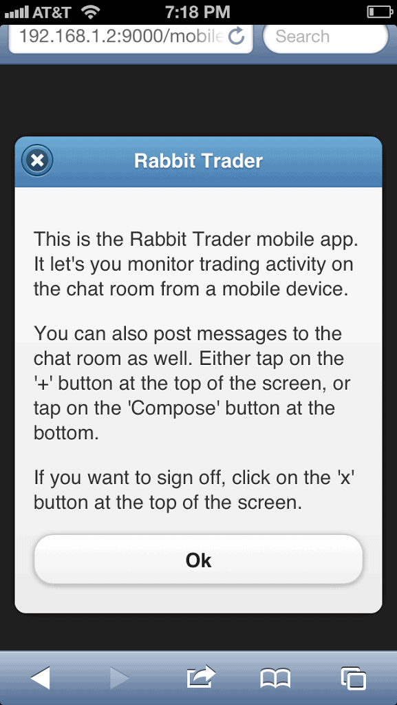
Creating another page for information was easy, since I was already coding the thing as a one-page app. It was critical to keep the page with the websocket handling javascript in the browser, and it also reduced the number of routes I had to add on the backend. From the app’s point of view, this three-page mobile front end was just one big HTML page. I just added another div data-role=”page” and wired it in. I then marked it as a dialog, making it nicely popup with an “Ok” button to close it and return back.
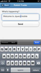
The rich UI had a textarea at the bottom so the user could type messages, and was wired to use return keystrokes to send the message into the websocket, so it would travel to all clients that were hooked in. This was a bit impractical when I tested it on my phone. So I moved the entry of data onto a separate “page” on my multi-page mobile app. I also switched the publishing of events to insert the latest message at the top of the string of messages, the same way that twitter does.
All in all, my phone provided an easy way to make sure my mobile experience was not only working but highly practical.
Think about your favorite mobile site as a source of inspiration
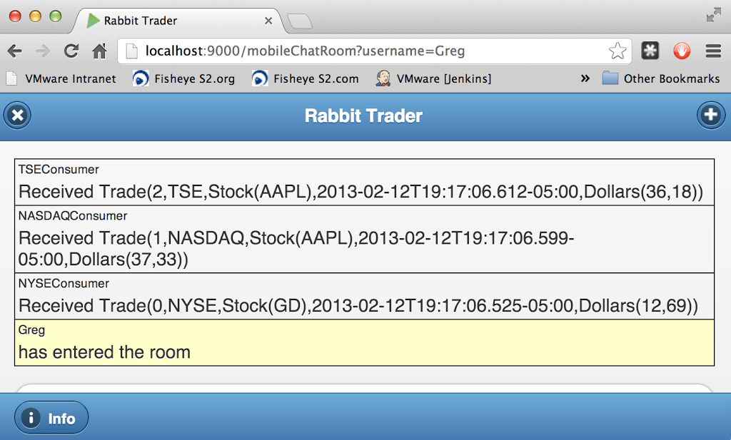
When I was thinking in my mind what the mobile view of things should be, I immediately thought of mobile.twitter.com. It has a top bar as well as secondary navbar. Bellow that is the string of data. I instantly started thinking of how to use this general flow of things, but customized to meet my requirements.
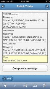
One thing that the rich interface included was marking posts from the owner with a light yellow background. They had a particular CSS class to assign. When I decided to add that, it was time for me to dig in and code some CSS myself.
The next thing I observed on twitter’s layout was how they put each tweet into a separate table structure. The username data is on one row while the message content is on another row. Then they have CSS classes to ensure consistent formatting. jQuery Mobile follows a minimalist approach, so while they can lay things out, they don’t style the content with borders. I fiddled with CSS borders on each entry. I quickly decided to apply every entry with the following CSS class:
.message-container {
 border-left: 1px solid black;
 border-right: 1px solid black;
 border-bottom: 1px solid black;
 width: 100%;
}
Then I coded another CSS class to create the “top” border, and used jQuery to first remove the top class from whatever element had it, and add it to the new element I was creating that would get prepended at the top.
I might replace black with something like grey, but for now, it looks great. And seeing it dynamically update on the iPhone is fantastic. Combined with being able to asked Siri to actually write my messages makes for a great mobile experience.
Conclusions
Simply put, jQuery Mobile makes it incredibly easy to layout, style, and wire up a mobile front end. Given today’s explosion of mobile devices, there is simply no reason to not develop a suitable front end. It requires a little bit more than just adding some extra classes to your screen. But in the end, the people that see your handy work will be blown away. I certainly am.
FYI: All data shown on the screens is mock data and does not represent real stock data.

 This drove me to add a third button for information. I tried to put it at the top, but it turns out that headers only have room for two buttons, and I had used them up. I wasn’t about to add a navbar just for the sake of an info button. So I created a footer navbar with the info button. It displayed nicely, but the footer itself was as slim as the button. I added class=”ui-bar” and it added just a touch of padding, making it look perfect. Finally, I topped it off with data-position=”fixed” so it wouldn’t get pushed off the screen as new messages arrived from the websocket.
 The rich UI had a textarea at the bottom so the user could type messages, and was wired to use return keystrokes to send the message into the websocket, so it would travel to all clients that were hooked in. This was a bit impractical when I tested it on my phone. So I moved the entry of data onto a separate “page” on my multi-page mobile app. I also switched the publishing of events to insert the latest message at the top of the string of messages, the same way that twitter does.
 One thing that the rich interface included was marking posts from the owner with a light yellow background. They had a particular CSS class to assign. When I decided to add that, it was time for me to dig in and code some CSS myself.
0 Comments